Updating this website to actually be good
I’ve had my personal portfolio site for about a year now, and finally recently decided to commit to a complete rebuild. The current design looks a bit bland, but my main focus is on making something not overly generic, as it is very easy and all too common to come across cookie-cutter modern, self-aggrandizing sites. (For reference, check out Sylvan Franklin’s videos roasting some dev portfolios).
Because any portfolio site is content-heavy, I decided to go with Astro as my build framework, as it is content-first and static for speed, while also allowing islands of interactivity.
- Main pages: Home, Skills, Projects, Blogs
Home: Pretty standard. I think it’s cringe to mention things like “aspiring developer” or “full stack expert passionate in ___” so I put a short semi-meta introduction, links to the other pages, and the resume embedded right there so nobody has to click twice.
Skills: To me, it is difficult to parse a long list of abstract skills and their relative importance, so I think a natural way to display them is with a graph. Determining the parameters of the graph is tricky to balance visual clarity though: if I list or relate too many skills together, it loses most meaning. In the end, I settled on the name-image circular node model with simulated repelling and unified random noise force, highlighting edges that are used together in the same project.
The graph is derived entirely from the project frontmatter: every project lists its languages, libraries, and tools, each of those becomes a node sized by how many projects use it, and every pair that appears in the same project gets an edge. So adding a project updates the graph for free. It’s drawn on a canvas with a hand-rolled force simulation: pairwise repulsion, springs along edges with a rest length that grows with node size, a weak pull to the center, a slight attraction to the mouse, and a slowly wandering global drift so it never fully settles and looks alive. It runs a few hundred warmup iterations before the first frame, so you don’t watch it explode out of a random initial layout. Clicking a node lists the projects that use it.
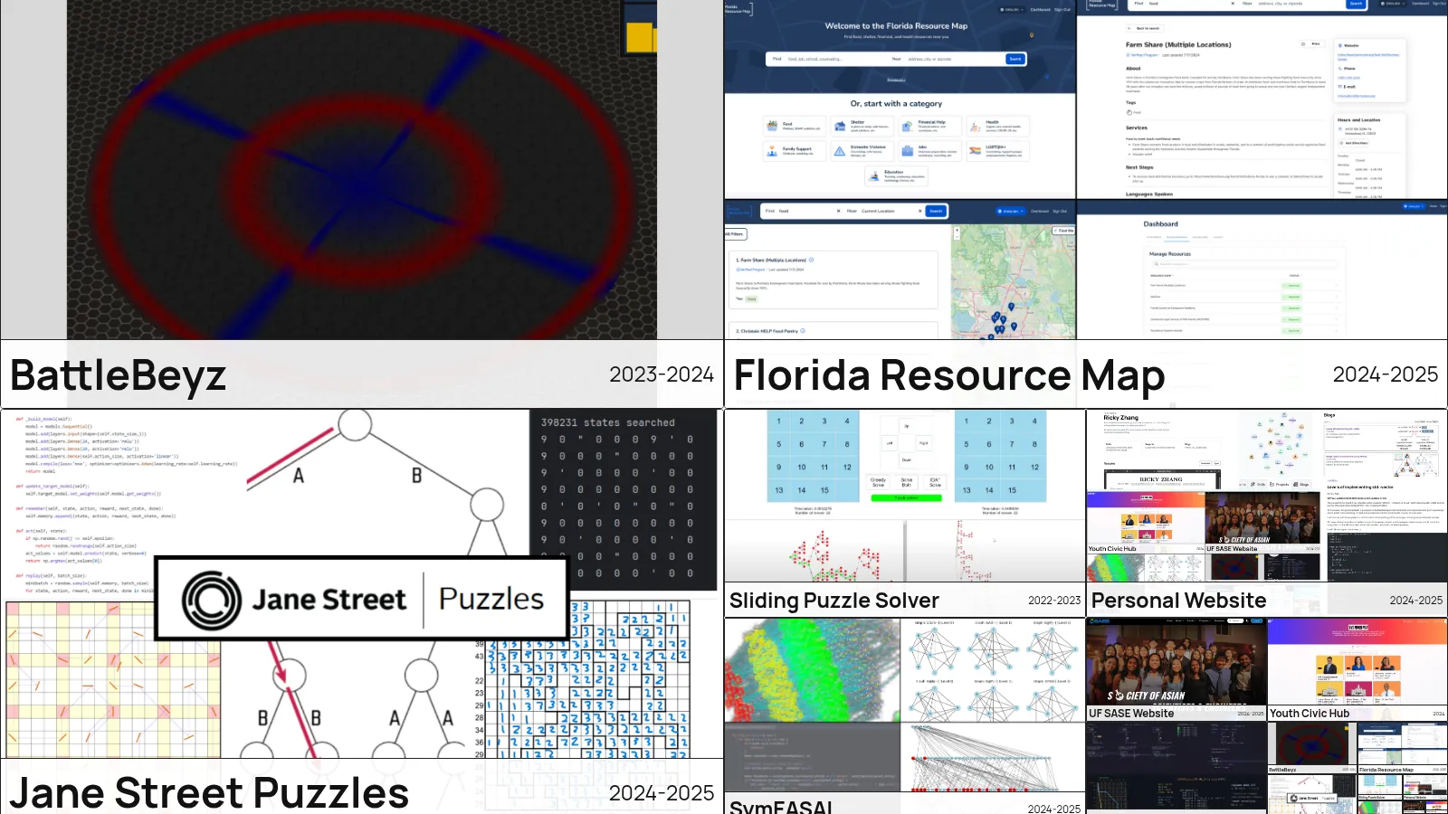
Projects: This was the main thing that I wanted to be very cool, and I got inspired by a really cool infinite zoom effect on “Chomosuke’s site”. However, their effect was written in Dart; While Dart is great for handling these vector scale animations, it is not compatible with Astro. Thus, I took on the challenge of translating the logic into React.
The layout is a 2x2 grid: three project tiles, and the fourth cell holds another 2x2 grid, which holds another, and so on until a cell is under ten pixels wide. Scrolling zooms toward the bottom-right corner. The trick that makes it “infinite” is that the nested grid is exactly half the size and sits exactly in the bottom-right, so scaling the whole thing by 2 about that corner produces a grid that is pixel-for-pixel the same layout as where you started, just one layer deeper. That means the zoom state is only an integer layer count plus a fractional zoom in [0, 1), and the visible scale is always 2 to the fraction. Tile indices wrap modulo the number of projects (which has to be a multiple of 3), so the recursion cycles through everything forever.
The hard part was making the layer swap invisible. I keep two absolutely positioned layers, each its own React root, with the transform origin at the bottom right. The active layer is scaled by the fractional zoom each frame. The inactive layer already has the next layer rendered into it. When the fraction rolls over an integer, I set the incoming layer’s scale to 1 (zooming in) or 2 (zooming out), flip which one is visible, and immediately render the layer after that into the now-hidden root. Rendering has to be flushed synchronously before the swap; otherwise you get one frame of the old tree at the new scale, which was the flicker at the borders that I chased for an embarrassingly long time. Wheel input just adds to a velocity, which decays exponentially, and the animation loop stops itself once velocity is negligible so it costs nothing while idle.
The tiles themselves size their text with container query units, so a tile six layers deep renders its title and year at the right proportion with no measuring in JavaScript. Hovering a tile blurs the image and shows the description, and the whole tile is a link to the project page.
Blogs: What you’re seeing right now. I had a whole lot of content to translate over, but one of the benefits of Astro is that content can be automatically organized and formatted as something like structured mdx files. So, it was pretty simple to add a bunch of attributes to the blogs, and have each blog page be generated. Each post is an MDX file with a zod-validated frontmatter (title, date, description, tags, optional cover image), and the listing page is a small React island with search and sort. The search and sort state lives in the URL query string, so a filtered view can be shared or reloaded, and the back button behaves.
Deployment: The first version of this site was deployed to GitHub Pages, which I wrote about in the previous website post. This time it’s on Vercel through the Astro adapter, which was mostly a one-line change and comes with analytics. Page navigation uses Astro’s view transitions, so moving between pages doesn’t feel like a full reload.
There’s still a lot I want to tune, the projects page in particular could use more projects to fill out the recursion, but at least now the site does something a template can’t.